RETAIL EXPERIENCE DESIGN · 2023
Frito-Lay
Kiosk
Experience
An in-store interactive kiosk concept designed to serve two radically different audiences; children, and time-pressed adults, within the same 30-second retail moment.
CREATIVE DIRECTION
EXPERIENCE DESIGN
UI DESIGN
RETAIL ACTIVATION
24
SKUS
2
UX FLOWS
2
AUDIENCES
1
DESIGNER
KIOSK SCREEN
"Design a kiosk that could sell, entertain, and retain, serving both a 7-year-old grabbing their mom's arm and an adult who just wants to get in and out."
Frito-Lay needed a physical-digital retail moment capable of living in top-tier grocery and big-box chains. The challenge wasn't just interface design; it was building a creative system that could serve radically different users simultaneously, while remaining modular enough to flex for seasonal campaigns and brand partnerships.
Play as the universal entry point
01 - Creative Strategy
AUDIENCE A · CHILDREN
Delight first,
Commerce second
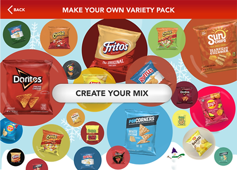
Floating chip bubbles on the home screen create immediate tactile intrigue. The bubble-pop selection mechanic turns browsing into a game, reducing friction by making interaction feel like play rather than shopping.
AUDIENCE B · ADULTS
Speed without
sacrificing choice
A radial dial variant offers a faster, structured path to brand selection. The vending machine drop animation signals cart completion without requiring a read, designed for peripheral comprehension at a glance.
Two flows,
one visual system
02 - The work
RADIAL DIAL - ADULT FLOW

BUBBLE SELECTION - CHILD FLOW

VIRTUAL DROP - FLAVOR SELECTION

SEASONAL & SPONSORED SKINS

Why it was
designed this way
03 - Creative Direction
01
Dual flows, unified language
Two selection interfaces, radial dial and bubble-pop, were designed to coexist within a single visual system, allowing retailers to configure by audience context, store type, or time of day without a full redesign.
02
Modular background architecture
The kiosk environment was built as a swappable canvas: NFL, Minions, seasonal, so brand partnerships could be activated without touching the core system. This kept production costs low and partnership value high.
03
Commerce embedded in experience
The customized variety pack isn't a checkout step; it is the product. The kiosk creates desire through curation, then fulfills it via in-store pickup or home delivery subscription, extending revenue beyond the single transaction.
04
Motion as communication
The vending machine drop animation was chosen deliberately — a culturally legible metaphor that signals "added to cart" without text. Critical for a bilingual retail environment where reading speed and language fluency vary widely.
Built to scale
04 - Outcomes
Subscription pathway
Embedded subscription model increases customer lifetime value beyond the single in-store transaction, turning a snack impulse into a recurring delivery relationship.
Retail scalability
Modular system designed for deployment across major chain environments like Walmart, Target, and Kroger, without reskin cost or engineering overhead per location.
Partnership-ready
Background swap architecture built for brand collabs like NFL, seasonal campaigns, studio IPs; activatable with zero changes to the core interface or UX flows.
MY ROLE
Sole designer across concept, strategy, and execution.
CREATIVE DIRECTION
UI DESIGN
EXPERIENCE DESIGN
VISUAL DESIGN
Tools: Adobe Illustrator · Adobe Photoshop